Your brand is more than just a logo and a color palette – it’s a voice, a mission, a personality. And in a world overflowing with visual content, posters remain one of the most powerful offline tools to express what your brand truly stands for. But here’s the catch: not all poster designs reflect brand values clearly. Some are eye-catching but completely off-message. Others look polished but lack emotional pull.
So, how do you ensure your poster designs not only look good but feel like your brand? Whether you’re a small business, a startup, or a seasoned company, this guide will walk you through how to design posters that speak your brand’s language.
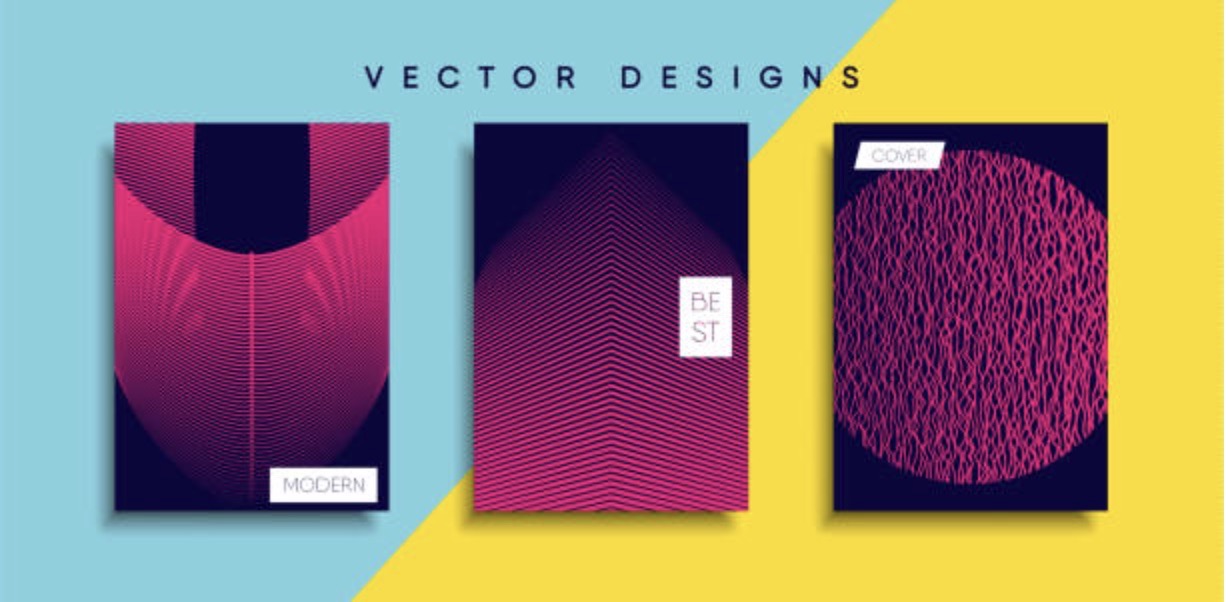
And hey, if you’re exploring different posters printing offerings for your next campaign, make sure your designs are brand-aligned before hitting “print.”
Why Brand Alignment in Posters Matters
Before diving into tips and tactics, let’s get clear on why this matters.
Consistency Builds Trust
According to a Lucidpress study, consistent brand presentation across platforms can increase revenue by up to 23%. Posters are part of that puzzle – when someone sees your poster in a coffee shop or at an event, it should instantly feel like you.
Emotion Creates Connection
Designs that echo your brand values help forge emotional connections. If your brand is about eco-friendliness, a nature-themed design with recycled textures tells that story instantly. Misalignment creates confusion – and confused customers don’t convert.
Step 1: Define Your Core Values Clearly
Before you even open up Photoshop or Canva, take a moment to revisit your brand’s core values. These are your non-negotiables, the beliefs that guide your brand’s behavior and decisions.
Ask yourself:
- What does my brand stand for?
- What emotions do we want to evoke?
- What are our top 3–5 brand values (e.g., innovation, honesty, inclusivity)?
Example:
Brand: A vegan skincare company
Core Values: Sustainability, transparency, and self-care
Design Implication: Use earthy colors, handwritten fonts, and imagery that reflects clean beauty and environmental consciousness.
Step 2: Match Your Visual Elements with Your Values
Once your core values are crystal clear, it’s time to translate them into visuals.
Typography
Fonts evoke emotions. A modern sans-serif font might feel sleek and tech-forward, while a serif typeface feels more traditional and trustworthy.
- Minimalist brands: Use clean, open fonts.
- Playful brands: Opt for rounder, bolder typefaces.
- Luxury brands: Stick to elegant serifs or custom scripts.
Color Palette
Colors are powerful. According to Color Psychology research, 90% of snap judgments about products can be based on color alone.
- Green: Nature, sustainability, growth
- Blue: Trust, professionalism, calm
- Red: Passion, urgency, excitement
- Black: Sophistication, exclusivity, boldness
Ensure your poster color scheme mirrors your brand’s emotional tone.
Imagery & Icons
Use images that feel authentic to your brand. Stock photos are okay – but avoid generic ones. Choose visuals that:
- Reflect your audience’s lifestyle
- Align with your message
- Match your values in tone and diversity
Step 3: Craft Messaging That Reinforces Your Mission
Words matter just as much as visuals.
Your poster headline, subtext, and CTA (call to action) should reinforce what your brand stands for.
Example:
Brand Value: Empowerment
Weak Headline: “New Collection Available Now”
Better Headline: “Unleash Your Power – Our Boldest Styles Yet”
Even a CTA like “Shop Now” can be rebranded to something more value-driven like “Join the Movement” or “Start Your Journey.”
Pro tip: Keep messaging short and punchy. Posters get scanned, not studied.
Step 4: Design with Context in Mind
Where your poster will live matters – a lot.
- Event Posters: Make your logo prominent and messaging immediate. Use visuals that resonate with that specific audience.
- Retail Posters: Focus on products and USPs (Unique Selling Propositions) aligned with your brand.
- Street Posters: Go bold. You have a second to grab attention.
Make sure your brand voice stays consistent regardless of the environment. Even when you’re adapting the layout or size for different placements, your brand tone should remain unmistakable.
Step 5: Use Templates Without Losing Identity
Templates are time-savers – but don’t let them water down your brand.
If you’re using platforms like Canva, Adobe Express, or Figma:
- Customize every element (colors, fonts, images)
- Avoid overly trendy templates that don’t reflect your long-term branding
- Save branded templates for consistency across future campaigns
Templates are a great starting point, but your brand values should guide every customization.
Step 6: Collaborate with Your Marketing & Design Teams
Brand alignment is a team sport.
Before finalizing your design:
- Get input from marketing on tone and messaging
- Check with design for visual consistency with other materials
- Run a quick internal audit: Does this feel like us?
Having brand guidelines helps – but real alignment happens through collaboration.
Step 7: Test and Evolve
Just because a poster aligns with your brand today doesn’t mean it will next year. Brands evolve. So should your visuals.
What to Track:
- Engagement: Are people scanning the QR code or taking photos?
- Recognition: Do viewers immediately associate it with your brand?
- Conversion: Is it driving traffic or sales?
Survey your audience, run A/B tests, and be open to tweaking your approach based on what works.
Bonus Tip: Align Your Printing Quality with Your Brand Too
A premium brand needs premium paper and finishes. A grassroots nonprofit might go for recycled materials. Your choice of printing says just as much about your brand as the design does.
When comparing posters printing offerings:
- Look for eco-friendly options if sustainability is key
- Choose matte vs. gloss depending on your tone
- Consider texture, thickness, and size in your visual storytelling
Pro tip: Some print services allow for QR code integration and custom finishes – great for blending digital and physical branding.
Final Thoughts
Your poster is more than a flyer on a wall – it’s a brand storyteller.
By aligning your designs with your brand’s core values, you:
- Build stronger customer trust
- Create more memorable campaigns
- Drive real engagement, both offline and online
So, the next time you design a poster, don’t just ask “Does it look good?” – ask “Does it feel like us?”
Your brand deserves nothing less.